Overview
Your navigation UI is one of the most important parts of your site, but so many designers neglect to give it the attention it needs. Today we’re going to be going over 7 principles of navigation design to help you get your users where they need to be.
.jpg?updated_at=2023-07-25T06:25:54.605Z)
Make It Easy
This is your guiding principle. If you’re ever confused, come back to 0. Your job in creating a navigation menu is to make it as easy as possible for users to find what they’re looking for, and from there to pay you for it. Making something complicated or esoteric is going to drive away users in droves. Ask yourself:
- How easy is this to understand?
- How easy is this to navigate?
- How easy is this to use?
Ask yourself those questions frequently and loudly, and use them as a guiding star when you’re lost. In the end, everything else is just an extrapolation of this idea. Such as:
Link Everything
One of the most common navigation issues I encounter is when top-level menu items aren’t clickable categories. Baymard did a study back in 2013 showing that users expect these items to be linked, and get annoyed and more easily lost if they’re not. Let’s use our own site navigation as an example. If you hover over ‘services’, you’ll get a dropdown showing everything we do.
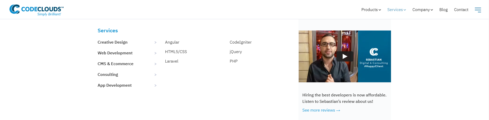
If you click ‘Services’, you’ll get taken to an overview page that has the same options as the nav menu. This pattern repeats as you go deeper: if you hover over CMS & E-Commerce you’ll get a submenu and if you click it you’ll get taken to an overview that has links to the submenu items on it.


This sort of repetition isn’t just acceptable, it’s vital—it gives users multiple opportunities to end up in the places you want them to be. Users aren’t stupid, but they often take different roads to get to the same place, and you want to design with that in mind.
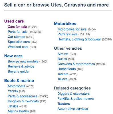
This is less of a problem if it’s obvious whether a category is linked or not. Trade Me Motors is a great example: “Other vehicles” isn’t clickable, but you can tell immediately just by looking at it, and so users will cut straight to the subcategory. The issue arises when they try to click and it doesn’t work: it disrupts the user experience and makes the user significantly more likely to bounce.
There’s a bit of a tradeoff: too many links will overcomplicate things and might lead people away from where they need to be, but too few will leave them with nowhere to go. The right number will depend on the size and nature of your site. If in doubt, is your current number making navigation easier or harder?
Use Dropdown Indicators
Let’s play spot the difference:
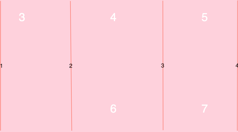
One of these categories doesn’t have a dropdown menu, and I’m willing to bet you can guess which. It’s not just us, either: if you jump back to Trade Me, you’ll see this:

You’ll be noticing a lot of those for the rest of the day, because they’re absolutely everywhere. You immediately know what they mean without having to think about it, and you don’t even see them unless somebody points them out to you. They’re a great illustration of the ideal UI: useful and totally invisible.
Trust Your Design Patterns
We often talk about Design Patterns with reference to software development but they’re equally relevant in, well … design. Certain things work because they work, and attempts to mix them up usually end up confusing users. One of the great pitfalls of navigation is a designer trying to be too clever and innovating a bit too hard; a wheel with three corners is an innovation, but that doesn’t mean it’s any good.
For example, here’s Twitter’s navigation menu:
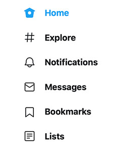
Now they could change those menu items to be bird-themed (“nest”, “fly”, “shiny thing!”) but that could confuse users, and more straightforward menu items don’t. They have a little bit of fun with it, but in a way that’s still recognisable. The ‘home’ icon is a bird house, but still obviously a house; there are ways to be creative while still working in a way that leads to good UX.
And that’s Twitter: they’re one of the biggest social media platforms and they could get away with being a bit more obtuse because they’ve got a massive built-in user base who would adapt quickly, but they don’t because there’s no point. It works, and there’s no point fixing things that ain’t broke.
Make Your Logo Clickable
Speaking of clickable things and following convention, what do you think happens when you click the logo in the top-left of our site?


You go straight back to the homepage. Again, this is extremely common, and you only tend to notice it when somebody fails to set it up properly. The more complex your site is, the more vital this becomes—giving users an escape hatch lets them reset their journey instantly, and that’s crucial for if they get lost.
And while I’m here on clickable pictures, product images should link to product pages. If you’ve got a hero carousel filled with product images, it’s almost useless if a user can’t click the image and go straight to the page. Users aren’t going to go rooting around in your menu to find the product unless they really want it, and they’re unlikely to have become that attached to a picture on a carousel. Somebody is on your site because they want something from you, and your job when designing navigation is to make it as easy as possible for them to get it.
What’s New?
If you’re in an industry with high trend turnover like fashion, one of the most simple and effective things you can add to your navigation is a “What’s New” menu. We don’t have one ourselves because our services don’t change much, but if you look at a major clothing retailer like Uniqlo or jewellery store Kagi, you’ll see it right at the top:
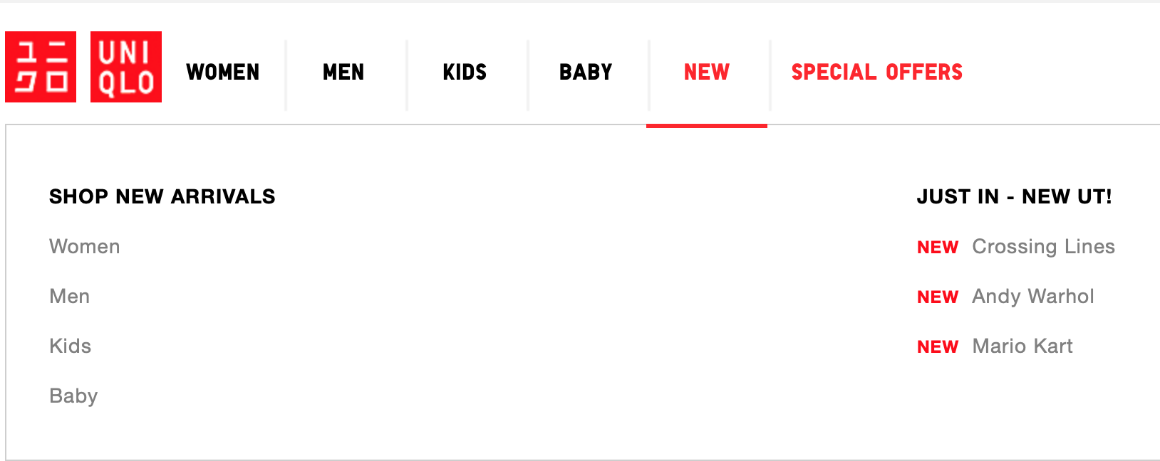
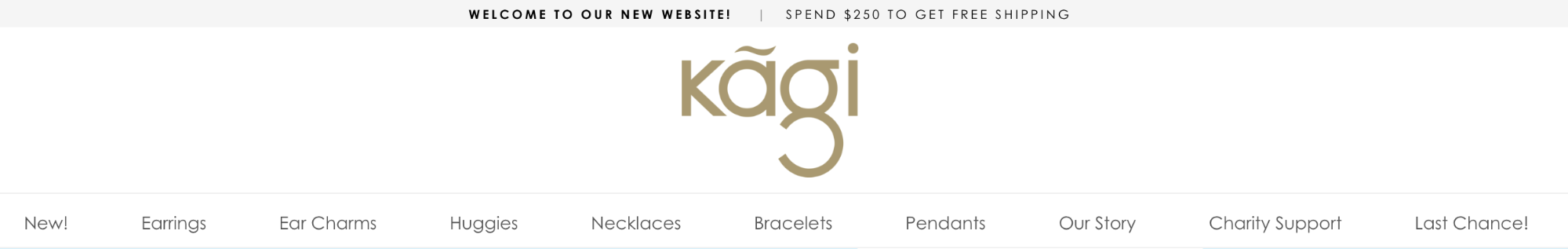
This is huge for returning users, and incentivises regularly checking in to your site to see what you have today that you didn’t have yesterday. It also means more opportunities for users to stumble onto the same content, and as we’ve already discussed, that’s a good thing.
To Mega Menu or Not To Mega Menu
A mega menu is a drop down menu, but bigger. The general rule of thumb is that, to be a mega menu, it can’t just be vertical: it needs a horizontal axis. If you look at a site like Best Buy, you’ll get dropdowns like this:
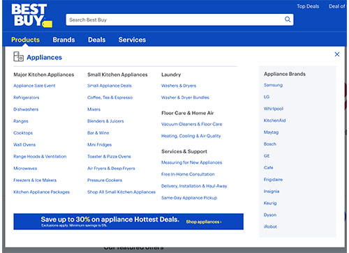
Mega menus are very popular in retail, and for anybody with a large range of products that are hard to cover with a standard vertical menu. If you crammed that Best Buy menu into a single column, it would disappear off the page and then some.
Oh wait, they did that.
A menu shouldn’t have its own scrollbar. They really thought this was better…someone there should check their carbon monoxide detectors, see if they need fresh batteries.
It really depends on what counts as a conversion for you. They’re great for retail because “success” for a big retail brand can mean a lot of things—somebody buying a bed is there for very different reasons than somebody buying headphones or cough medicine, and you want them all to go in different directions to find what they’re looking for, whereas at CodeClouds all our services coalesce around the same basic idea: we’d like you to hire our developers. There are variations of that (e.g. hiring Laravel development services vs hiring Shopify developers) but everything funnels down to the same few pages, and thus a mega menu is less appropriate for us—it distracts users and keeps them away from the funnel.
Or, going back to 0: would a mega menu make navigation more easy or less easy?
Really, a UI is like breathing: you don’t pay attention to it unless something has gone horribly wrong. Your goal is to keep it light, clear, and unobstructed. Using a good UI is easy; making a good UI is hard.

Similar Reads
How can we help?
Tell us about your inquiry and we’ll get back to you as soon as we can.