Our Story
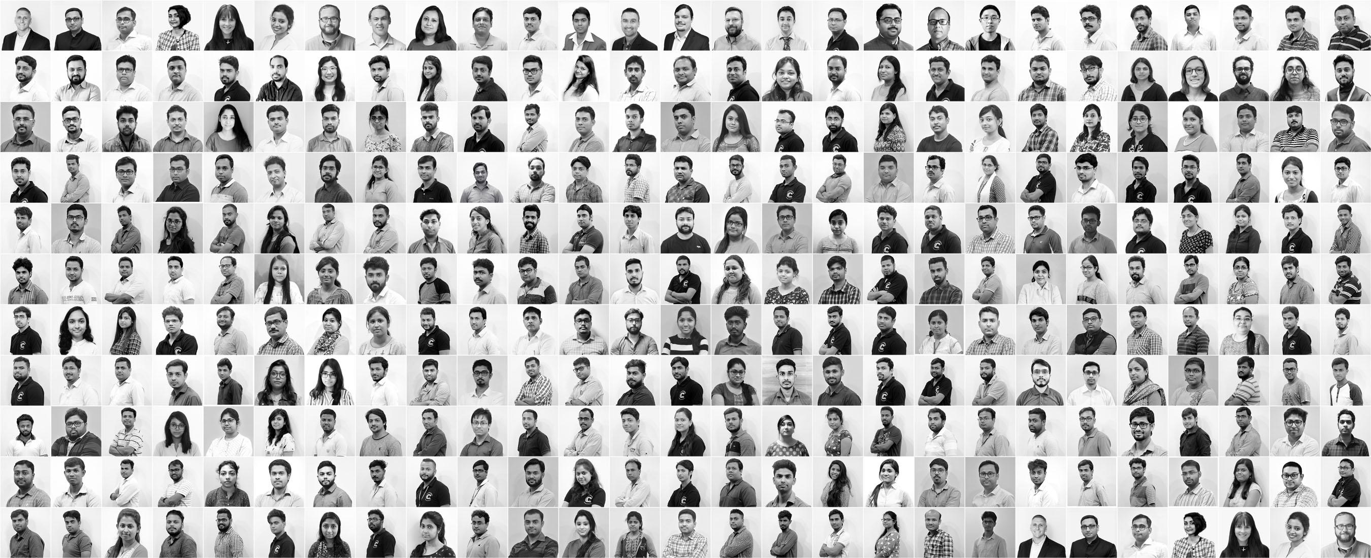
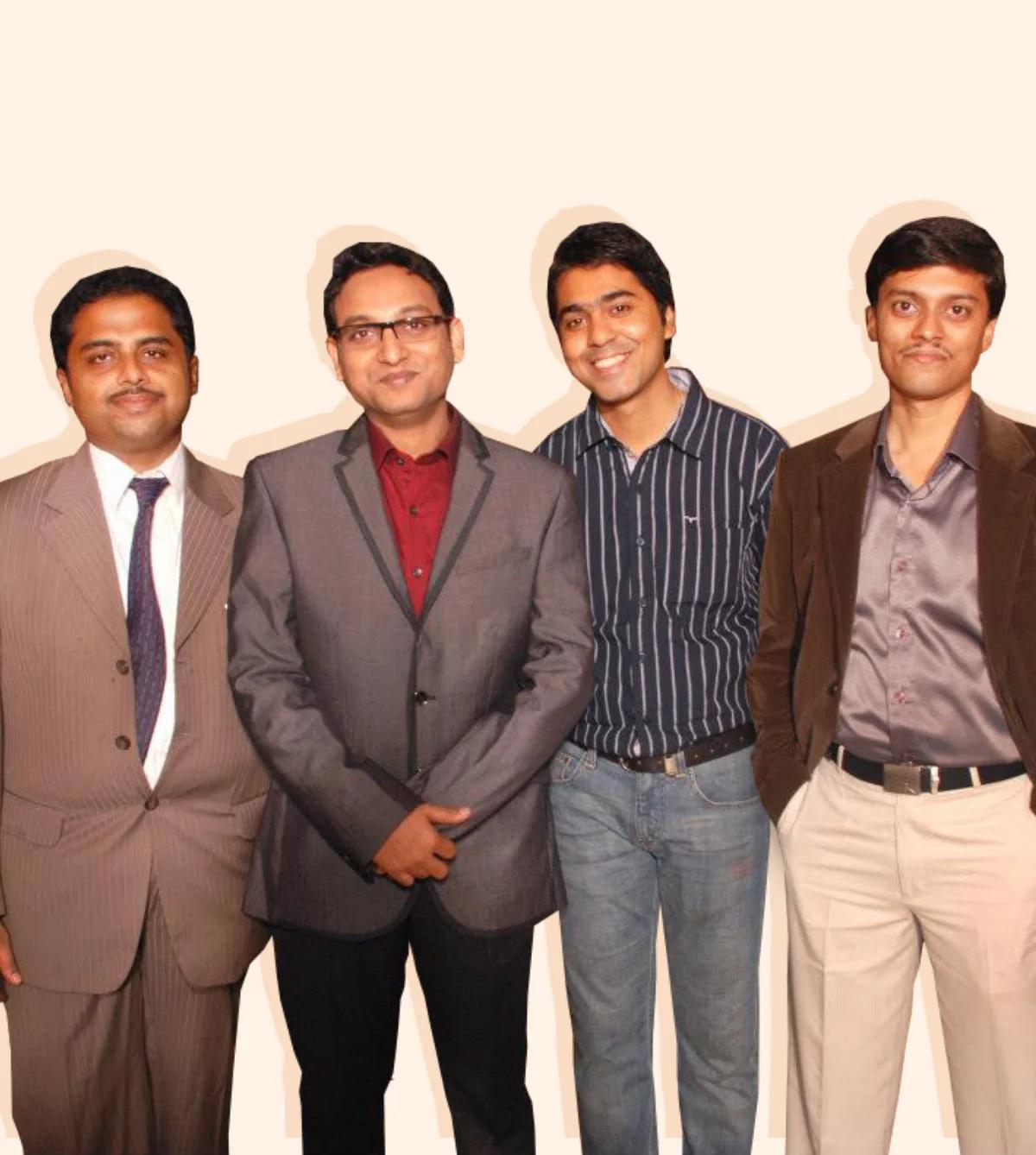
Since our founding in 2009, CodeClouds has grown from a group of 4 individuals working in a small apartment in Kolkata, India to an international team of more than 600+ professionals today. Our global offices in India, the US, New Zealand and Australia allow us to create a team of unique individuals with different cultures, perspectives and experiences.
Together we have accumulated years of experience in custom web and software development, as well as design and consulting. We’ve established an extensive repository of knowledge, meaning we can deliver the right talent to our clients quickly, efficiently and with value-based pricing.
Travel with us on our journey.
Our Vision
“Our vision is to be the premier software development company, known for delivering innovative and high-quality solutions that exceed our clients’ expectations and help them achieve their business goals.
We strive to create an environment where our team can thrive, grow, and continuously learn, and to be a trusted partner for businesses looking to transform their operations through technology. We aim to make a positive impact on the world by using our skills and expertise to build solutions that solve real problems and make people’s lives better.”
— Brian Hill
Talented Members
Years in Market
Projects Delivered
Client Satisfaction
Awards & Counting
We believe in
Your Success
We don’t just deliver projects, we bring effective solutions and value to help your business grow.
Talent Cultivation
We believe personal growth is crucial and we help our employees achieve that in various ways.
Glass Box Approach
We operate in a way that is open and transparent, putting integrity and honesty first above all else.
Equal Opportunity
Everyone has equal opportunities regardless of their gender, age, disability, orientation or nationality.
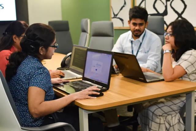
Continuous Innovation
We stay up-to-date with emerging technologies to ensure clients get the best possible solutions.
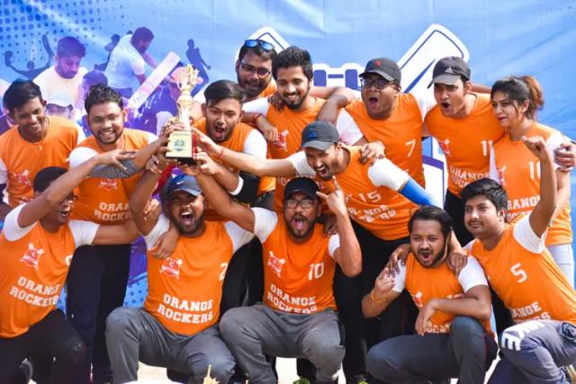
Celebration & Fun
It’s not all about work! We make it a priority to celebrate every special moment with our team.
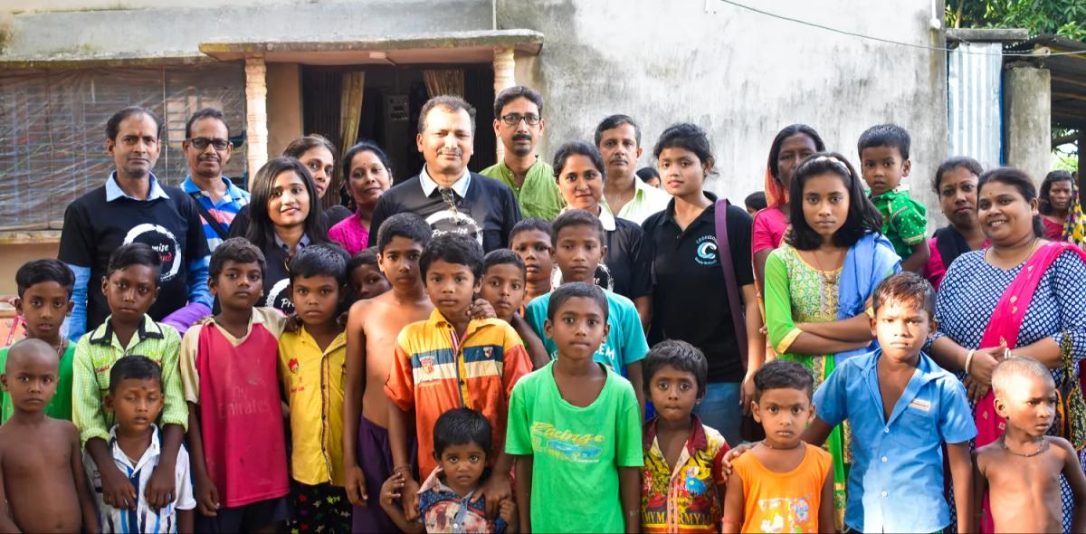
Discover our partnership with local organizations to help those in need in the community.
Our Social ResponsibilityWhat keeps us going

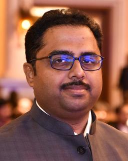
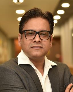
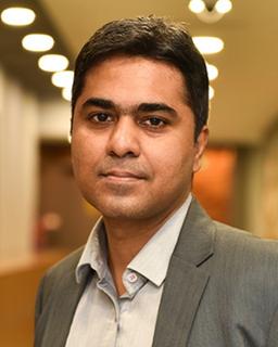
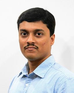
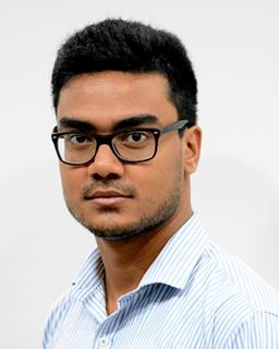
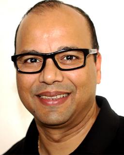
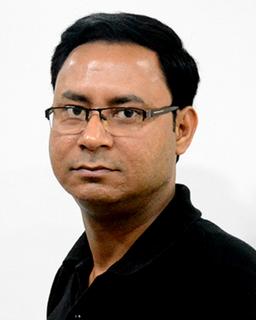
Meet the team

Brian Hill
President

Kinkar Saha
Chief Disruptor
Subhojit Ganguly
Chief Operating Officer
Prosenjit Saha
Chief Financial Officer
Biplab Pal
Chief Technology Officer

Sushant Saha
Chief Talent Officer

Mark Petroff
Vice President - Enterprise Strategy
Subharun Dey
Vice President - Client Services
Supratim Roy
Managing Director, Enterprise Services

Josh Warfel
Director of Sales

Raunak Gupta
Director of Products
Gautam Roy
Director of Technical Support

Ananya Saha
Director, Business Support
John Saha
Australia Regional Director

Somnath Bhattacharya
Director of Learning and Development

Ashish Kumar Singh
Director, Project Delivery

Brij Patel
Director, Project Delivery

Haiphie Hua
Head of Strategic Partnerships

Scott Hunley
Principal Consultant, Enterprise Services

Jeswin Thomas
Director - Sales, Asia Pacific

David Fung
Lead UI/UX Designer
Prasenjit Seth
Senior Project Manager

Pius Werner
Creative Manager

Mark Hosler
Project Manager

Jacob Clancy
Content Manager

Subodip Saha
Business Analyst

Dazzle
Chief Woof Officer
Our Clients
Our dedication to delivering quality and effective solutions has given us the opportunity to work with well-known brands and companies in various industries.
Tell us about your inquiry and we’ll get back to you as soon as we can.