Overview
Font rendering is the process by which operating systems take text and turn it into display text. It has stayed relatively static for decades, but big things are happening-learn about how web fonts are turning the game upside-down.
We’ve all been there: you’ve spent days putting together templates, and your site looks perfect. You’ve tested it on desktop, you’ve tested it on Android, you’ve tested it on every size and permutation of screen in-between. Your CSS is practically poetry. Deployment comes around and your colleague opens it up on a Mac and—
Disaster: something has gone subtly-yet-horrifyingly wrong with the kerning; letters are totally the wrong density, and it seems to change from letter to letter; strange knife like edges protrude where before, there were beautiful curves. You’ve just learnt a hard lesson in font rendering, an important factor in web design that-if not accounted for-can turn your deployment into a nightmare.
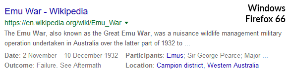
What a Google search looks like on different operating systems. Google uses Arial, and not a web font, for searches.
The Basics
What’s going on? Put simply, different operating systems display typefaces differently. The process by which these systems turn vector images into rasters varies wildly from system to system, and you need to be aware of the intricacies of the problem in order to anticipate and deal with it.
Some Terminology
Anti-Aliasing: generally, anti-aliasing is any technology which smooths out the edges of a digital image. In font rendering this usually refers to grayscale rendering, when black/white pixels around the edges of a letter have their intensity toggled to give the glyph a softer edge. However, sometimes it refers to RGB subpixel rendering (see below) and sometimes it’s being used more generally to talk about digital edge smoothing techniques. It’s important to consider the context when you see this term.
Rasterization: most images coming straight from a designer or artist are what’s called a vector graphic: an image where the position of each point is relative to the position of each other point. Vector graphics are clear and highly scalable, but their file sizes can be larger and this means they have issues being displayed on a lot of devices. To get vector images into a format that digital devices can handle, they must be turned into rasters: images of a set size, composed of pixels. Rasterization is the process that converts vector images to rasters.
Subpixel Rendering: if you take a magnifying glass to an LCD monitor, you’ll notice something interesting – each ‘pixel’ is actually three dots appearing together in a pattern, usually Red Green Blue (sometimes Blue Green Red, or Red Green Blue and White). From a distance, the human eye interprets them as a single colour. Subpixel rendering toggles the intensity of these dots to help further smooth out the edges of letters. So, for example, if the blue dot is touching the intersection of hairline and crossbar of a capital A, it can be toggled to be darker so it blends into the black pixels of the glyph more, making the corner less sharp. This helps to smooth over any bumpiness you’d get from pixelation, and allows more precise fine-tuning than grayscale rendering. This is also called colour fringing.
.png?updated_at=2023-07-26T11:12:14.624Z)
How the Big Three Handle Font Rendering
So we’ve got the three biggest desktop operating systems in the world: Windows, MacOS, and Linux. How do they render fonts?
Windows
Windows used to be the king of font rendering, but they’ve lost their competitive edge recently. Their venerable GDI (Graphics Device Interface) handles most of the rasterization, while their proprietary ClearType system does, among other processes, the RGB subpixel rendering. Microsoft have traditionally been very protective of ClearType, which has given them a huge leg up on the competition since its release with Windows CE 2, but in the last 3-4 years other operating systems have started challenging this supremacy.
In Windows 8 they introduced DirectWrite, which is a DirectX API that seems to be incrementally replacing the GDI. Windows 8 also flirted with the idea of only having grayscale (‘Gray Cleartype’) rendering, but Windows 10 came back with RGB subpixels—some W10 functions still run Gray Cleartype but most text will have colour fringing.
For a very long time, Windows used the Apple-developed TrueType font library, and their operating system is still, to this day, decent at rendering Apple fonts. However, they are slowly moving onto their own OpenType library (co-developed with Adobe). They do still support TrueType but it is not clear to what degree this will continue in the future.
OS X/macOS
For years, Apple was careful about how it implemented subpixel rendering in their OS—Microsoft was very hawkish about ClearType and Apple didn’t seem to want to step on the patent. They developed their own version (‘LCD font smoothing’, added in 2002 with OS X 10.2 Jaguar) but it didn’t really stand up to ClearType. Instead, their teams got very good at developing typefaces for their operating systems: designing in such a way that they were clear and beautiful without needing to go near the RGB balances. Apple typefaces look incredible in Apple devices for this reason. The other factor in recent years has been the high resolution Apple displays, starting with the mid 2012 launch of ‘Retina’ displays. The excellent scaling in OS X now makes subpixel rendering not really a necessity, at least with screens built in to Macbooks and iMac 5k displays. On Mac, fonts are greyscale rendered and have some anti-aliasing, but are not needed to be displayed at a low resolution due to the high typical pixel density.
Apple TrueType technology is composed of two parts: the vector graphics that compose the fonts themselves, and their own inhouse TrueType rasterizer. The nomenclature can get confusing: sometimes you’ll hear TrueType refer to the rasterizer (say, in a comparison to ClearType/GDI) and sometimes it refers to the fonts themselves. Even though TrueType is slipping a little in its position as the king of font rendering, most Windows and Linux devices still support it.
As time has gone on, 4k screens and Apple retina displays have become a lot more common, and their extremely high PPI mitigates a lot of the issues Apple devices previously had—high pixel density smooths out the edges much better than any amount of RGB toggling could. Suddenly, Windows fonts looked great on Mac devices.
Some macOS users also run FreeType, which we’ll talk about in the Linux entry. Speaking of:
Linux
.png?updated_at=2023-07-26T11:18:51.846Z)
You know how I said font rendering varies wildly from OS to OS? Well with Linux it varies wildly from distro to distro. Most Linux distributions will run some variant of the open-source FreeType library. It uses a TrueType interpreter, and the most common versions in current circulation are v38 and v40. FreeType comes with its own rasterizer, and the library also supports TrueType and OpenType.
v38 threw caution to the wind and trampled all over a bunch of patents to get the best characters possible. Its glyphs are on the fuzzy side but are very clean—you won’t find any random thick stems or vanishing ascenders here. Unfortunately, the patch author just stopped checking in one day and nobody is quite sure what v38’s current status is.
v40 is the current most advanced version of FreeType. It’s stripped down from v38, and only goes near protected stuff like RGB subpixel rendering if the Microsoft patent has expired. It is very good at preserving line lengths, x-heights and hints, but does this by noticeably thickening the glyphs; all text in FreeType v40 is going to look half-bold. It’s not as bad as previous versions, but it’s still noticeable.
Subpixel rendering is still fairly new to FreeType (v38 came out in 2016. Three years seems like an aeon in tech terms, but font rendering moves relatively slow) and they still don’t really have the hang of it—their system architecture isn’t built with it in mind, and it hasn’t been as cleanly integrated as it could be. Linux has got issues with font rendering that run deep and it doesn’t look like there’s going to be a fix any time soon.
Web Fonts as an Alternative
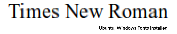
Any font rendered by the system is going to look different from OS to OS, even if it is a “web safe font”. The same font files on different operating systems may even produce different results!
The answer is to use web fonts, which are hosted online and partially rendered by the browser. Things like Google Web Fonts and Font Awesome are examples. The browser itself if responsible for most of the rendering process, however the subpixel rendering or anti-aliasing differs from OS to OS. For example, Google Chrome and Firefox may look slightly different, but Firefox on Ubuntu, Mac, and Windows will all render the font the same way – meaning that they will look identical in size, thickness, and spacing on all operating systems. Mac for example, won’t use subpixel rendering, but it will line up with other operating systems on the same browser just fine.
.png?updated_at=2023-07-26T11:12:14.297Z)
Mac still will not use subpixel rendering on web fonts
Since supporting the most common browsers should already be a part of your development process, this means very little extra testing is required if you use these fonts.
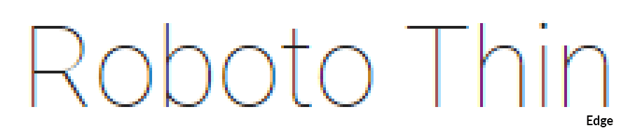
Typically, rendering fonts different from browser to browser doesn’t involve major issues like spacing or size, rather things like Anti-Aliasing are slightly rougher looking on one browser than the other. Google Chrome had a major problem with anti-aliasing some years ago, for example. These days, font rendering on browsers has gotten much better, and these font will look very close between Chrome and Firefox. Currently, the Anti-Aliasing and subpixel rendering is slightly different, but it’s hard to notice. The sizing is the same on Firefox and Chrome, and is slightly off in Edge since it always has to be special like that. Chrome renders the font thinner looking that the other two.
Web Fonts on Windows 10
You’ll see slight differences between operating systems, but the OS only handles the rasterization step, meaning that the thickness and spacing, the important part, will all line up! This also makes these fonts a great choice to ensure they work right on mobile as well.
If you’re looking for direct alternatives to system fonts, most have web equivalents. For example, the classic Windows Impact is almost identical to Google Anton.
.png?updated_at=2023-07-26T11:12:14.626Z)
.png?updated_at=2023-07-26T11:12:15.089Z)
So there it is: to overcome the traditional issues with font rendering, use web fonts. Or, find a developer who knows how to convert your existing system fonts into web fonts. You may not notice the difference if you only use one OS, but the instant somebody opens your content elsewhere, they’ll notice.

The experts in our New Zealand based UI/UX design and development team are able to give you the best looking website while handling any issues like font rendering that many other firms wouldn’t even consider. Our designers are able to walk through what you need to achieve what you want, and they speak in terms you’ll understand. With a team of more than 300, CodeClouds is the one stop shop for everything you need in terms of creating attractive yet functional web pages for many different platforms. Contact us today to learn more.
Similar Reads
How can we help?
Tell us about your inquiry and we’ll get back to you as soon as we can.