Overview
There’s no gentle way to say it: abandoned shopping carts are losing you money. We go over some of the common causes, and what you can do to prevent them.
Depending on where you source your data from, somewhere between 60-90% of all online shopping carts get abandoned. It’s a frightening number for any store owner-you’re losing massive amounts of money from people who already clicked buy. Is something going catastrophically wrong? Well, no. Let’s go into the reasons why users abandon shopping carts, and what you can do, and what you can’t do.
1: Don’t Hide
The #1 biggest motivator behind dropped carts is one that’s fairly easy to address: when a user sees the price of an object being $x, then goes to checkout and sees $x+50, they drop the cart immediately and never come back. Unexpected or hidden charges are a major conversion killer. Additional costs like shipping should be clear from the outset, before the user decides to buy. This will drive away some clicks, but if the extra $50 was going to scare them away, they’re not going to suddenly have a change of heart when it jumps on them at checkout. More likely, they’re going to remember you negatively, as though you’d tried to trick them; the user doesn’t know whether you were trying to conceal costs or whether you just didn’t consider the UX, and many of them will assume malice on your part.
It’s best to have the full price available from the outset, but if you can’t (because, for example, you don’t have a way to automatically calculate shipping), it’s important to have notices like cost does not include shipping so users know to expect extra at checkout. The more costs you’ve hidden from the user, the more likely they are to abandon before conversion.
2: Don’t Make Users Sign Up
Users hate being forced to create an account before they can buy. It’s another decisive factor in dropped carts. Accounts are a great way to get loyal return customers, but forcing a user’s hand on the issue is a huge turnoff and will actively undermine your attempts to build your brand. Personally, we recommend suggesting an account for purchase, but not requiring one—if a user likes what you’re selling and they come back, that’s when they tend to sign on. A simple, easily-closed JavaScript CTA popup can be a great way to do this without turning people off. It should make clear the benefits of signing up (we’ll have your address for future purchases/we’ll be able to customise your store/we’ll be able to send you coupons and promotions etc) but it should also be easy for users to get rid of if they’re not inclined to sign on yet.
Another way to get around this is to set up Facebook or Google login using their API. It’s a sort of half-account that doesn’t give you as many options, but it’s one that users are a lot more comfortable setting up.
3: Simplify Your Checkout Process
There’s a recorded correlation between number of checkout pages and number of dropped carts. The ideal number is 3-5, and the absolute roof is 8. The more pages you have, the less complex they should be. This means to only ask for information you absolutely need, and nothing more.
This also means streamlining your funnel so it points directly at the purchase. The more side-routes you force a user down, the more likely they are to abandon your cart—redirects and extra pages and interruptions will kill conversions. The perfect checkout process is arguably Amazon Kindle. It has two stages:
- Buy this product
- Congratulations, you’ve brought the product. Go back to the store?
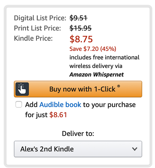
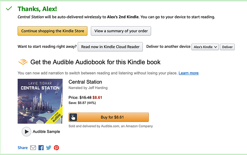
Which does, in fairness, require setting up an account. A non-account version might look like this:
- Buy the product
- Enter payment/delivery information, confirm purchase (and hey, if you set up an account while you’re here, you won’t have to put in all this information next time)
- Success! Go back to shopping?
In both cases, you want to limit the amount of data you request, and the number of clicks involved. I know there’s a temptation to request a lot of data to help build up user profiles and metrics, but it is actively scaring away customers. If you really want to collect that sort of data, don’t do it at checkout.
This also means reducing the amount of visual clutter during the checkout process. You want to do this on your site in general, but especially during checkout you want to avoid banners/gifs/popups/colourful visual elements unless absolutely necessary.
4: Look Professional
Horror stories about scammers abound everywhere, and users who get a bad vibe from your site are likely to leave before completion. There’s a few things you need to be aware of so you don’t end up looking scammy:
- Make sure your SSL certificates are up to date. A lot of modern browsers will throw up a PHISHING DETECTED warning if they sense a shopping cart without working SSL certificates. Some will even refuse to let the user go further.
- If you’re not GDPR compliant, you need to change that. Aside from the obvious legal and ethical reasons, users now look out for signs that you’re following the rules as an indicator that you’re on the level.
- Your site needs to look good. It doesn’t need to be an absolutely bleeding-edge progressive web app, but it does need to look professional. And hey, if you need to hire UI/UX design services, you’re in the right place.
- Use social proof elements like reviews and testimonials, though be aware that many sites buy or fake these and users are aware of this: a reviews section that is entirely 5-star reviews with generic copy is going to do the opposite of what you intend.
- Provide detailed product descriptions and photographs. One of the better-known eCommerce scams is the product whose physical dimensions don’t match what the pictures suggest, such as the infamous “six foot” teddy bear, or tiny doll clothes being photographed to look like human clothes. If you can, your descriptions and photographs should make clear exactly what the customer is getting.
5: Mobile Matters
2017 was the year where mobile finally overtook desktop as the preferred platform for shopping. If you’re not optimised for mobile in 2019, what are you doing? We’ve talked about the sad state of mobile optimization and mobile eCommerce before but if you want a short version: pages that take more than 3 seconds to load have a 70% dropoff rate, while the average time for a splash page to load is 11 seconds.
All of this applies to your sales funnel as well: if any individual page takes too long to load, the chance of abandonment skyrockets. Users are tolerant of delays in certain transitions (say, processing a payment gateway) but even then you want to try to cut your load times down as much as possible. Consider looking into AMP or Responsive Design for lightning-fast and hassle-free mobile page loading.
6: Where’s the Cart?
This should be an obvious one, but it’s amazing how many web designers slip up here. Is your UI designed in such a way that the shopping cart is easy to locate? If it’s hidden away somewhere in a toolbar, then you’re in trouble. Going back to Amazon again, but look at this:
.png?updated_at=2023-07-26T09:08:56.489Z)
It’s a great big shopping cart. You can’t miss it. It visually complements the surrounding elements while also being very, very obvious. It also has a number on it to tell users that there’s something in there—not only is it a great user feedback element, if they abandoned and came back, then they’re likely to check to see what it is.
7: Give Them A Nudge
Abandoned cart email reminders are a great way to bring back people who’ve simply forgotten about their cart. It happens! People are shopping on their phones and get distracted, then forget what they’re doing unless somebody gives them a nudge. Services like Mailchimp have tools that make automating this a breeze. You should be careful not to overdo this or customers will consider this spam, and unsubscribe. It’s also predicated on you first getting their email address—we recommend having an optional email field somewhere early in your funnel. Requiring email is almost as bad as requiring account signup, but putting the option there for users is a powerful tool for you.
There’s been a lot of debate around with the GDPR has killed reminder emails. It hasn’t, but it’s changed how you approach them: you need to be open about why you’re requesting their email (e.g. so we can send you special officers, and reminders about your cart) but it’s still perfectly within regulation.
8: Let Them Get (the product) Back To You
If you have a return policy, make sure it is clearly displayed somewhere on your pages. This is similar to our very first point, but inverted: so you don’t surprise the user, you tell them about a useful option they have available. It’s both forthright and useful: it’s a double whammy of trust building.Trust is a really important word for you to take away from this: since you don’t have a physical seller to interact with customers, your site needs to fill that space and create a bond of trust between you and your users.
You also want contact information clearly and easily available for anybody who needs it. I’ve seen store owners say they don’t want to have to deal with contact from users, but it’s going to happen whether you provide an avenue for it or not and it’s better that it happens in an inbox than on a public forum.
9: Are We There Yet?
A great element (especially in longer funnels) is a progress bar that lets users know what they need to do and how many more stages there are. It’s a bit redundant if you’ve managed to build an incredible 1-2 page funnel but if you need 4-5 pages then it’s something that tells users they’re close to where they want to be, while reminding them that their destination is checkout.
10: You Can’t Catch Every Fish
If you’re going to try to claim back every single lost cart, you’re going to go mad. A large number of those carts aren’t coming back—they’re users who are window shopping, or comparing prices, or who changed their mind last-minute. Trying to reduce abandonment to 0 isn’t an attainable goal, but if you’re reducing the number of dropped carts, then you’re doing something right. As they say, perfect is the enemy of good.If you’re realistic about trying to claim back the customers who will return, you can avoid wasting time on those who just aren’t coming back.

And that’s it! Our top ten tips to beating shopping cart abandonment. If you’re interested in learning more about eCommerce, check out our Guide to Dropshipping, or our comparison of WooCommerce and Shopify.
Similar Reads
How can we help?
Tell us about your inquiry and we’ll get back to you as soon as we can.