Overview
Those of us who have been writing CSS for a while remember a time before Grid, when all we could do was hack together tables and float, and pray for the best. Even flexbox (an absolute gamechanger) wasn’t perfect—it has issues with 3D layout, and gives you less control over the size of the individual elements. I still use flexbox all the time (hey, sometimes automatic > stick) but grid is a wonderful tool to have, and I’m happy I’ve been given the opportunity to share it with you all.
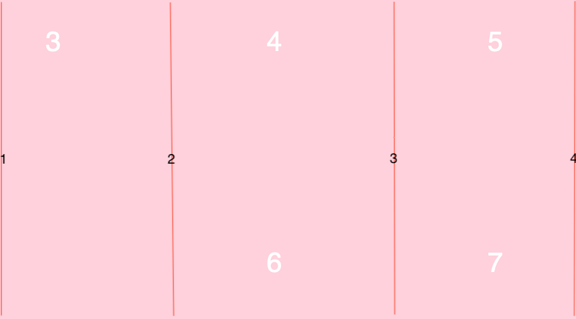
First things first, you’re going to want to set up your container.
In the HTML:
<div class="container">
   <div class="item">1</div>
   <div class="item">3</div>
   <div class="item">3</div>
   <div class="item">4</div>
   <div class="item">5</div>
   <div class="item">6</div>
   <div class="item">7</div>
   <div class="item">8</div>
   <div class="item">9</div>
</div>
and in the CSS:
 .container{
    display: grid;
    grid-template-columns: 5rem 5rem 5rem;
    grid-template-rows: 5rem 5rem 5rem;
 }
Which should give you something that looks like this:
.png?updated_at=2023-07-26T08:31:10.779Z)
Very basic, but everything starts somewhere.
display: grid tells your browser that it’s a grid, grid-template-columns (and its sister grid-template-rows) defines what’s in it. Display: grid will not work until you define either columns or rows. If all your columns and/or rows are the same size, you can use the repeat() function, so our CSS could read grid-template-columns: repeat(3, 5rem); grid-template-rows: repeat(3, 5rem); and function exactly the same, but be cleaner and easier to adjust later.
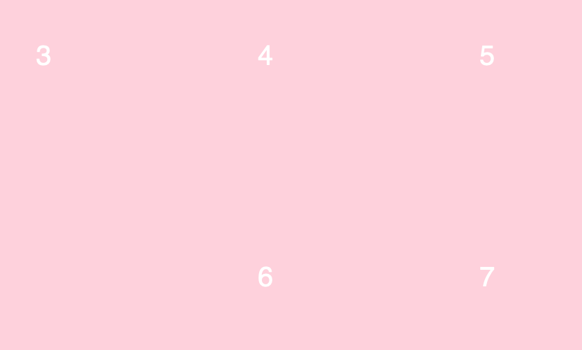
Next we need to think about grid-gap, which is the size of the margins between columns.
 .container{
    display: grid;
    grid-template-columns: 5rem 5rem 5rem;
    grid-template-rows: 5rem 5rem 5rem;
 }
Surprise, it does this:
.png?updated_at=2023-07-26T08:31:11.800Z)
You can fine-tune this with grid-row-gap and grid-column-gap if needed.
CSS Grids introduced a new unit of length called Fractional Units, or fr. fr are fractions of the free space remaining in the grid. I’m a bit of a traditionalist and prefer to stick with rem, but the option is there if you want to play around with it. The syntax is the same as any other unit, so for example, if you wanted to switch units you could change our setup above to grid-template-rows: repeat(3, 1fr).
Now, this is where it gets fun. We’ve set our column sizes, so that means we can’t change the size of anything within them, right? Well, no, we’ve just got to get clever with span.
To illustrate, we’re going to make a quick HTML change
<div class="item2">2</div>
then add the following to our CSS
.item2 { grid-column: span 2; }
Aaaaaaand
.png?updated_at=2023-07-26T08:31:11.805Z)
Ta dah, the second grid item is spread across two columns. I also made it millennial pink, to spare your eyeballs any more bare HTML. CSS Grid is capable of making new rows if your changes would push things onto a new line, as we see if we tweak another box:
 .item2 { grid-column: span 2; }
 .item6 { grid-column: span 3; }
.png?updated_at=2023-07-26T08:31:11.500Z)
We can also use grid-column-start and grid-column-end to choose where a particular item sits horizontally in our grid, which gives us even more fine control over placement. You’ve probably noticed that 6 is a little awkward sitting on its own, so let’s try something else:
.item6 { grid-column: span 1; grid-column-start: 2; grid-column-end: 3; }
Some of you might be a little confused at this point: wait, start 2, end 3? That looks like start 2, end 2. You’ve noticed something critical in understanding how grids work: the numbers don’t refer to the boxes themselves, they refer to their boundaries.
So, if we set our item6 from 1 to 4, what will it look like?
.item6 { grid-column: span 1; grid-column-start: 1; grid-column-end: 4; }
No peeking!
Have you got it yet?
You sure?
Okay, here goes.
Easy! You’ve got this. And speaking of things you’ve got, it’s been five minutes and you’ve gone from Grid Zero to Grid Hero.
The next thing you want to do is start looking at frameworks. We have a beginners’ guide to Materialize you should check out. If you can tell which numbers on my diagrams are Arial and which are Helvetica, then you might also want to read our guide to font rendering, which goes a little deeper into fonts and how they’re displayed on different browsers.
If you’re looking for CSS development work, we have openings for frontend developer jobs in Kolkata on our careers page.
If you’re looking for CSS development work, we have openings for frontend developer jobs in Kolkata on our careers page.

If you want to keep working with grids, I’ve made an editable copy of my millennial pink grid, which you can fork from here.
Similar Reads
How can we help?
Tell us about your inquiry and we’ll get back to you as soon as we can.


 Kolkata (HQ)
 Fort Wayne
 Wellington
 Sydney